Tips for Packaging, Branding, and Preparing Your Art
If you’ve watched any cooking shows in your life, you are fully aware that presentation is a big deal. Something that tastes like absolute garbage can look appetizing if plated with intention. Conversely, something that tastes like a gift from the heavens can look downright disgusting if the presentation is off. When you are trying to make art sales, you should aim to present your art in a professional manner.
It’s the finishing touches that hook people.
Packaging and presentation can take ‘okay’ art to the next level. Disregarding such things can turn away customers or prevent you from raising your prices. For example, when I first moved to California, I participated in an outdoor group show where three artists displayed in a pop-up tent on walls, and another artist brought a table to sell prints. This last artist was a perfect lesson on what not to do when selling my art.
All he had was a table and a stack of loose prints that he spread across the surface. His prints were displayed haphazardly. He used no protective plastic coverings and no backing boards. A slight breeze sent some pieces flying to the ground, which then resulted in him using rocks or other random objects to weigh them down. His art was exposed to the elements and to the fingertips of potential customers. His art was the least professional of everyone in the tent, even though his actual art looked great.
No matter how good the art itself looked, this artist couldn’t get more than $5 to $10 for a print because he neglected to consider presentation. Plus, the odds of the prints getting damaged at his display and when the customer walked away with the print were very high. Don’t be that guy.
Professional art presentation is really important.
When you are preparing to sell your art, you need to balance aesthetics and protection. You’ll want to make sure your art remains safe, while also making it look attractive to a customer. I know that funding is often tight when you start out, so don’t feel pressured to do everything on this list, but keep these ideas in the back of your mind as your art business grows. You don’t need to spend a lot of money to make your art look professional.
*Links contained in this post are affiliate links for Amazon and/or Blick Art Materials and I will earn a commission if you make a purchase at no additional cost to you. These commissions help fund more content like this, so thank you!
How to professionally prepare and present your art for sale:
When Presenting Canvases:
Clean up the edges- Either paint the edges a solid color, extend your painting over the edges, or use painter’s tape to block off the edges before painting to keep them clean.
Clean up the back of the canvas- If you are a messy painter, consider using Kraft paper and painter’s tape to protect the back of your canvas from drips and spills while working.
Varnish- Always seal your finished paintings. This will protect your work from fingerprints, and smudges. Some varnishes also include a UV coating to protect colors from fading. (My favorite varnish is Liquitex High Gloss Varnish from Amazon or Blick)
Resin- Resin is a huge trend these days. Both as a medium to create art, and as a protective finish for your canvas or wood panels. I personally haven’t tried it as I prefer my usual gloss varnish and hate toxic chemicals, but resin can really take a simple piece to another level.
Hanging materials– If you want to give your customers the option to immediately hang their art, read this post for tips.
When Presenting Paper/Flat Pieces:
Protective plastic- When you are selling online or in person, a protective plastic bag is a great idea. Shipments can encounter moisture in transit, and customers walking around an art fair are likely going to stop for snacks and beverages as they walk around.
When I need a couple of items, I order my plastic bags from Amazon (5″x7″, 8″x10″, or 11″x14″). When I need to resupply my entire stock of bags, I order from Clearbags.
Backing board- I highly recommend backing board as an extra layer of protection for your finished art within the plastic sleeves. The added rigidity protects your work while stored, shipped, and carried around events. I use Clearbags backing board most often, but Amazon is great if you need an item quickly (5″x7″, 8″x10″, or 11″x14″)
Frames and Matboard- Adding a frame and mat board to your work can take even a rough sketch to gallery level of presentation. If you work with standard-sized paper, you can find plenty of precut mats and ready-made frames to fit your work. Like this matboard on Amazon with a simple frame. (More tips in this post.)
Branded Art Details Can Up the Professionalism
Sign Your Work
A lot of artists believe your art is only finished once signed. Some artists stick with their full name in cursive. Some use initials. Some create a little symbol. Some use a logo. Some don’t sign their work on the front surface. Some don’t sign at all. Some include a date.
Whatever you decide to do, make it your own. Do what feels authentic to you. I personally don’t often sign the front of my work because I want customers to be able to change the orientation of my abstract pieces. Instead, I sign, date, and title my work on the back of every piece.
Name Your Work
Naming is the last thing I think about with my work, but it can add more context to your art, and it shows the world that you’ve put more care into what you created. It holds more meaning when it has a name.
Add a Story/Meaning
Knowing what inspired a work of art or what the piece means to the artist can help a viewer feel even more connected to the art. With pieces of higher value, consider writing a few lines about the piece. You can use this in online inventory descriptions or include the story near title cards at shows.
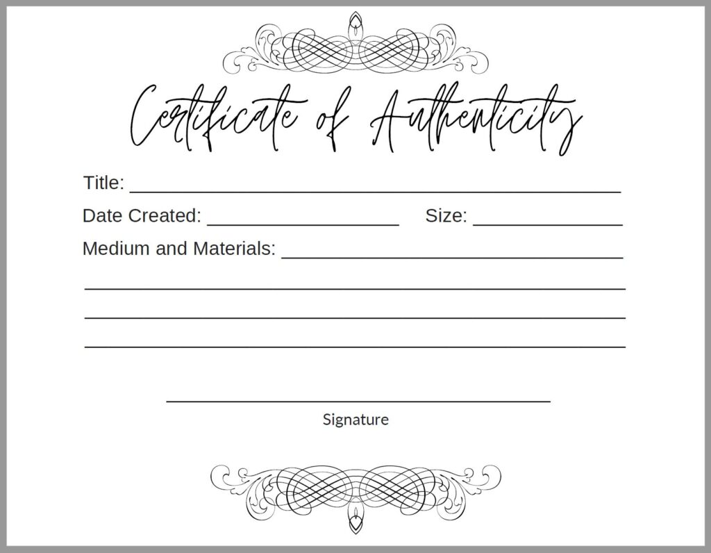
Include a Certificate of Authenticity
In my opinion, certificates of authenticity are a little hoity-toity, but I do love the care that is taken to document the details of a piece. I created my own certificate using Canva, but tweaked it for a little humor and call it a “Certificate of Messiness,” to match my brand. As of 2022, I started using “Certificates of Creation”. You can do whatever you want with a certificate. It doesn’t need to adhere to any art world standard, in my opinion.
If you want to include a Certificate of Authenticity, I recommend tracking details like title, size, date created, materials used, your contact information, social handles, and anything else you deem relevant for your art.
Below, you’ll see an example that I made using Canva. For certificates like this, I usually print four to a page on cardstock, cut with a guillotine cutter, fill it out by hand, and then put it into an A2 envelope.

Other details to consider to make your art more professional:
- Include a Thank You card with purchases.
- Use stamps with a logo or signature on the back of art or on shipping materials.
- Use stickers (Branded logos, thank yous, etc.)
- Use tissue paper/colorful wrapping in packages or when wrapping items at events. (Secure with twine, ribbon, or stickers.)
Framing and Hanging:
I’m not going into detail here about framing and hanging pieces as I wrote a post called Tips for Framing and Hanging Your Artwork for Shows. Definitely a worthwhile read to make your art look more professional.
***
This isn’t a comprehensive list by any means, but you can see the more care you put into your work, the more valuable it appears and becomes. This list can be added to, and not all artists will do everything on the list. If you can at least start by considering how you will protect your work while selling it, then you can slowly evolve all of the fun branded elements of your presentation over time.
Please leave questions and comments below while commenting is open or reach out to me directly through Instagram or email. I’d love to hear from you! Make sure to sign up for my email list below to never miss a blog post.
-Kelly

